

Being able to draw your technical analysis on your chart properly is a critical skill you need to master – it’s vital that you don’t mess up your support and resistance levels, because it could poison the rest of your trading.
Because there are so many data points on a price chart, there are a lot of different methods, and ways to approach to finding support and resistance levels on a price chart.
My method is to keep things very simple, logical and maintain the maximum amount of clarity possible on the chart – this is very important because I see too many traders getting lost in their own analysis.
In this article, I am going to talk about some common mistakes that Forex traders are making when they try to mark out support and resistance levels on their chart, which end up screwing up their trading.
Note: If you haven’t done so already – please make sure you read my first article: HOW TO DRAW FOREX SUPPORT AND RESISTANCE LEVELS
#1 – Just marking levels for the hell of it
If you find yourself marking lines like a zombie – I think it is important that you take a step back and think about what your doing. Ask yourself this question…
“Why do you place horizontal lines on your chart?”
I think the obvious answer is: “To draw out support and resistance levels”
I generally like to view my charts from a medium term point of view – meaning I have the chart ‘zoomed in’ at a moderate distance. This way I can see the daily candles clearly.
I don’t just go ahead and mark every single level I can find – I only mark the main ‘points of interest’ to my current analysis.
One reason I would draw a horizontal level is because I have identified a weekly support or resistance level – which I can’t really see from the daily chart unless I zoom out a long way.
When I am focused in on the chart for my medium term analysis (like in the chart shown below), I have the horizontal line marked that I found from a longer term view to remind me there is a weekly level there, which I otherwise would not otherwise be able to see from this perspective.
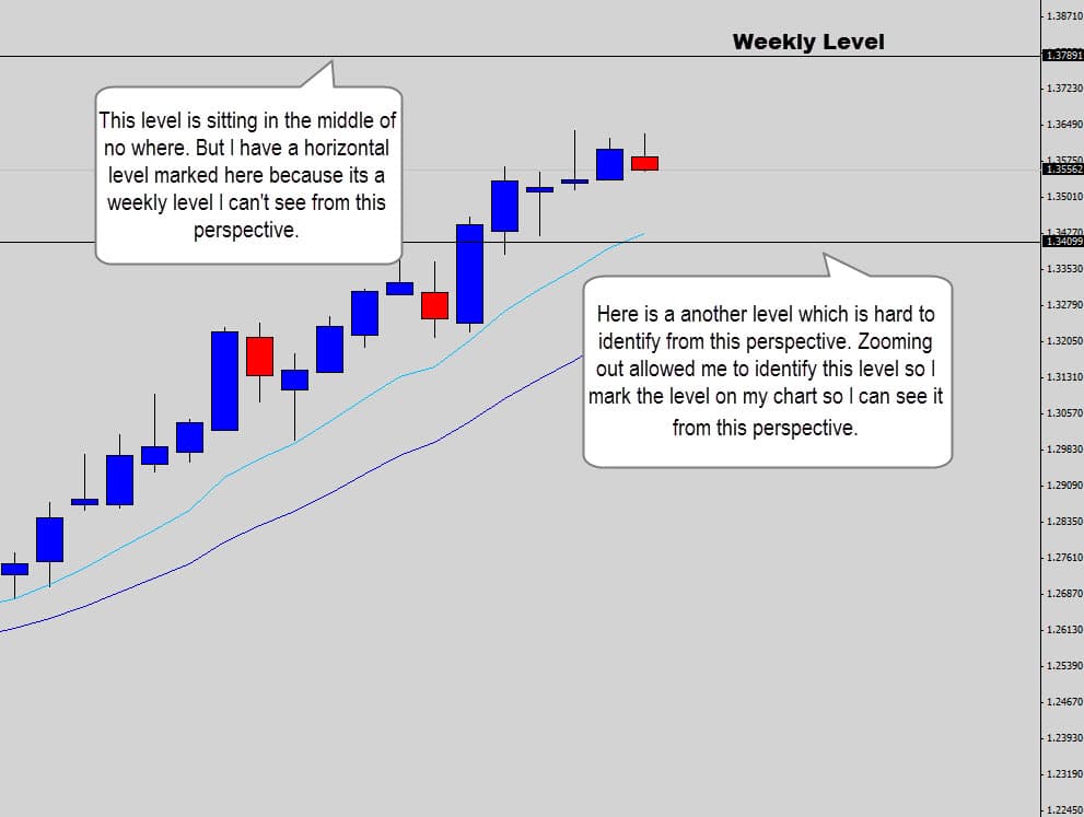
Notice above how I marked these key levels, because they are important from a longer term perspective – which I can’t see from this view. That is WHY these levels are marked on my chart.
Also notice how I didn’t go overboard and mark other long term price levels – I only marked what’s relevant at this point in time to keep my chart clean, and clutter free.
It’s important not to mark unnecessary levels that aren’t relevant to your current analysis – this is where things can start to get out of control…
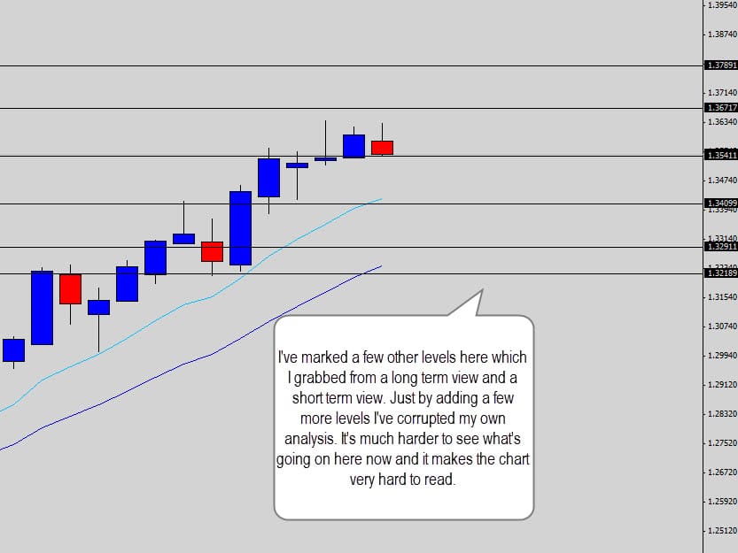
See how I have gone ahead in the chart above and marked some extra levels here which are really irrelevant to my analysis. I had no real good reason to mark these support and resistance lines on the chart. In most cases, traders who are guilty of this are just trying to be over analytical – but it doesn’t help.
Just by added a few extra unimportant levels on the chart, I’ve ruined my clean, logical analysis and created a confusing chart.
Your Forex charts should communicate your analysis back to you, and to other traders clearly – the above chart fails to provide any clear analysis. It is now just a bunch of confusing lines.
You have to ask yourself, are the horizontal lines you’re marking providing any value to your analysis?, or making the chart, and your trading more confusing than it should be.
Checkpoint
Don’t go and plot horizontal lines on your chart without a good reason. Only mark the important areas of interest for your current analysis in order to maintain a high level of clarity on your charts.
#2 – Trying to Mark Levels with Super Precision
This is is where I think of a lot of Forex traders get trapped when they try to draw their levels out. They are always looking for that perfect text-book definition of a support or resistance level where the market respects it to the pip.
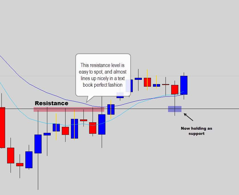
The above NZDUSD daily chart shows something close to a text book perfect example of a resistance level. But even here the candle wicks did not line up in perfect succession.
Notice how once the market broke through resistance, and retested the level from the other side – it held as support. Even here, the level was not respected down to the pip, the market ‘overshot’ the horizontal level a little before bouncing off it.
My point here is the market has an element of noise to it, and you are never going to get the highs and lows of the candles line up like some beautiful artwork.
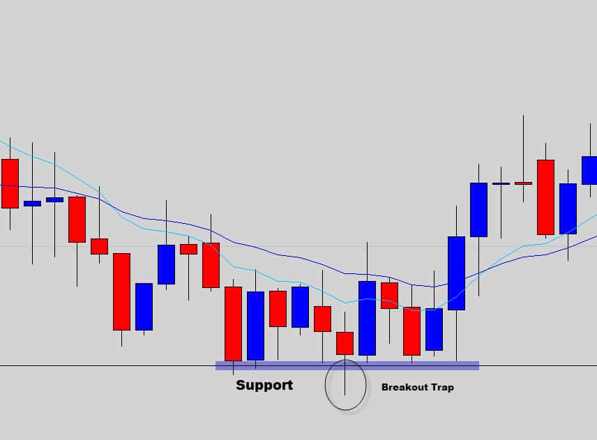
Here is another good example of those text book perfect scenarios some traders look for when they mark their levels.
The chart above shows an easy to spot support level. Notice here how there was an attempt to break lower, a breakout trap created by the market to suck in traders to get short by making them think the support level was going to break.
When you mark your levels, you need to consider these type of scenarios. You’re going to have a hard time lining up all the candle wicks here, and it may force an over analytical trader to mark two levels instead of one – the one I have marked and one at the low of the failed breakout.
Keep things simple and logical -> there is one support level here, and a failed breakout.
The skill of marking out the right support or resistance levels on a plain price chart is a skill you will develop over time. It is not just a purely technical task – there is some trader discretion behind it to.
Have a look at the chart example below. This is how I see many traders messing up the process by trying to ‘connect the dots’ so to speak, by marking multiple levels to get as many candle wicks to line up as possible.
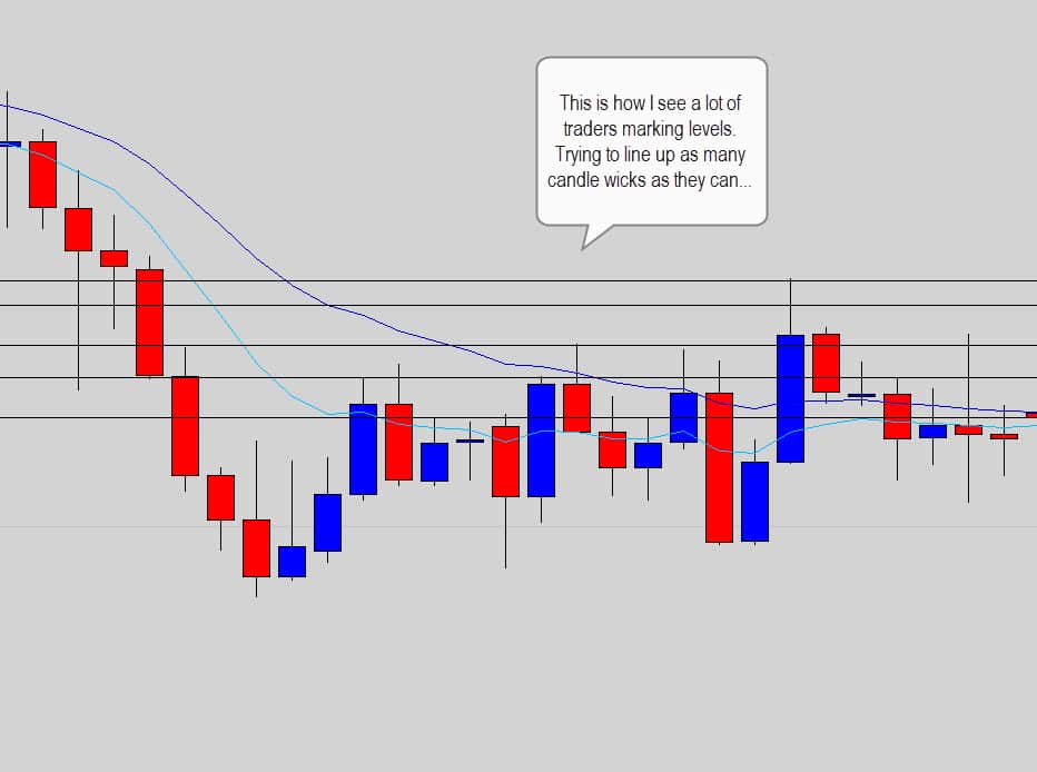
This chart is confusing, it’s hard to see what’s going on. The horizontal lines are making the chart hard to read. Once you remove the horizontal lines, take a step back and mark one important level out for the purpose of clarity – you get this…
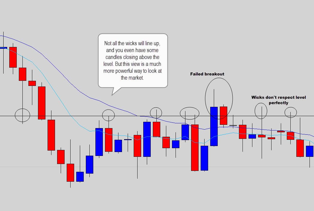
The above chart demonstrates how just one line can change your whole view of the market, and give you a much clearer picture of what’s going on. Even thought the candle wicks and their highs and lows don’t line up perfectly – there is still a level here.
Like I mentioned before there is a certain element of noise in the markets as the millions of transactions that take place cause price to vibrate. It’s also around these significant levels that you will see volatility spikes as the market tries to trap traders into breakout trades.
Checkpoint
Stop trying to mark support and resistance levels right down to the pip. The dynamic nature of the Forex market will rarely give you text book perfect levels. Mark only the important levels with a minimalistic approach to avoid confusion in your own analysis.
#3 – Over Doing It
So this one is an obvious mistake that I’ve spoken about before in some of my other lessons.
But I feel it is worth a mention again, because I am amazed to see traders continuously warping their charts into something that requires an Enigma coding machine to read. For those who don’t know – the Enigma machine was built by the Nazis in WWII to send & receive encrypted messages.
Check out the chart below…
This is an extreme example, but this chart is result of a trader who was just over the top analytical. I have no Idea what the trader is trying to communicate and I feel like he or she could have communicated better analysis just by using one or two support/resistance levels.
I find you get messy, confusing charts like this when traders try to mark out all the insignificant intra day levels. If you’re an intraday trader – firstly have a psychologist on your speed dial and second – there is no need to mark so many levels out, you can see them very clearly on the chart even when you’re at maximum zoom.
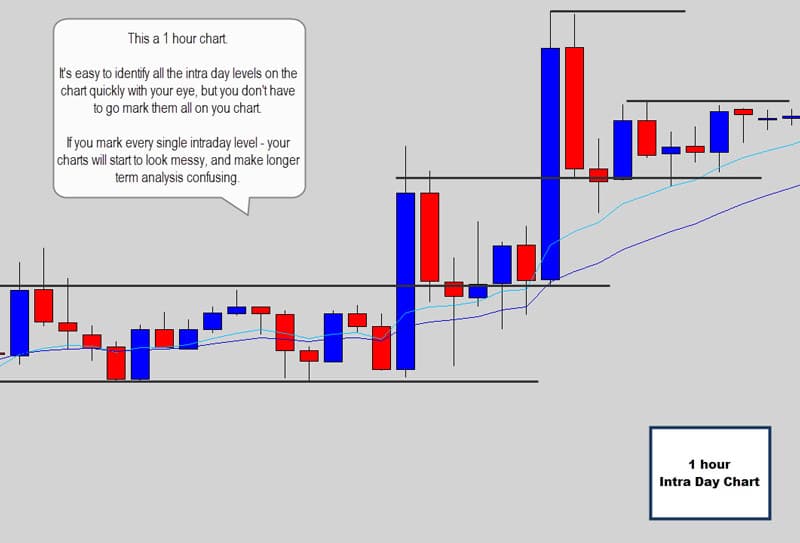
This applies to price action traders who love to get stuck into the 4 hour chart – there is no need to go and mark all the 4 hour swing levels from the last 5 years of price history – the ones you need to focus on are easily identifiable at full chart focus. Just mark one or two intraday level(s) and then move them up and down as price progresses through its trend.
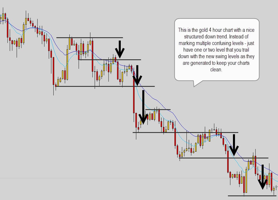
At any given time, this 4 hour chart of gold above could be beautifully expressed and mapped out with just two levels at any given time. In some cases it would be necessary to have an important level from the daily or weekly chart there marked which you expect to act as a strong turning point, but that is as complicated as it should get.
I mostly work from the daily chart – so I only mark critical daily levels that are important to my analysis at the time, and I will also plot out any important major weekly levels that price is approaching, and that’s generally it.
Here is one of my recent chart analysis on the EURCAD…
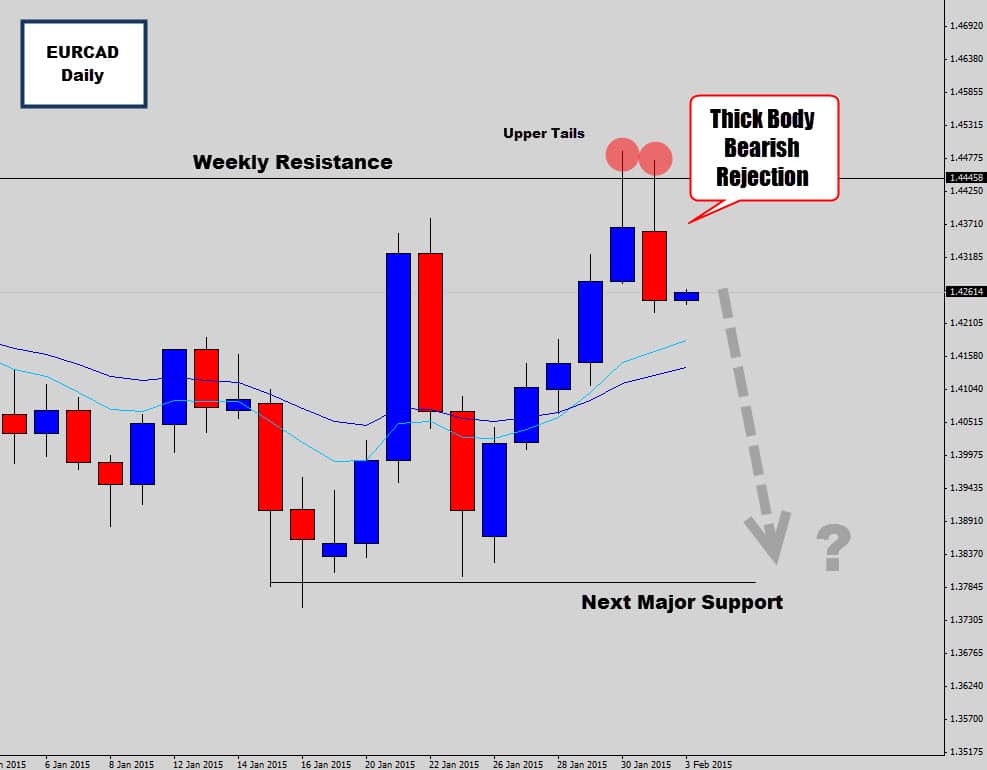
See how I’ve only mapped out levels which are important to my analysis. The weekly resistance level has been marked, which I grabbed from a more zoomed out ‘birds eye view’. We can see the daily candles reacting to this resistance level with bearish price action.
What I am saying here is I think the market is going to move down lower due to the fact we are getting a large bearish response from the weekly level.
Weekly levels are generally major turn around points in the market, and here we got the price action confirmation via a bearish reaction candle – one of the trade setups we teach in the Forex course.
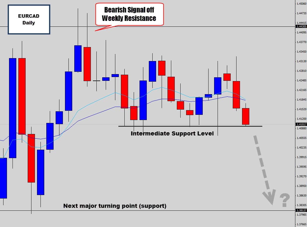
As anticipated the market did move down off the weekly level via the bearish price action signal, but the market has paused and found an intermediate support level between the two major levels.
The bearish price action still looks very dominant at this stage – so there is a good chance the level will be broken and head towards the next major level here.
Checkpoint
Over analyzing the market is dangerous. If you’re an intra day trader – don’t go crazy marking all the little details from the small time frames. Stick with one or two levels you can move up or down with the progressing price action. Only consider marking levels which have significance on the daily chart or weekly chart.
#4 – Marking Levels that Hinder Market Analysis
This is a big one, and I run to this all… the… time…
Depending on where and how you mark support and resistance levels on your chart is going to have a big impact on how you view that market and even have psychological implications.
Here is a trader’s chart that was shown to me the other day…
This chart was presented as a concern for a bullish price action signal that we were talking about on the GBPJPY daily chart.
This trader’s analysis is fine, but the way the chart is perceived could be a problem.
GBPJPY is in a bullish up trend at the moment, creating higher highs and higher lows. The mean value is angled up nicely and is being respected as dynamic support. There is a large bullish rejection candle buy signal right at what we call a ‘hot spot’ in the trend which basically makes this a text-book perfect buy setup.
The trader is arguing that there is resistance above (based on recent price history), so this trade doesn’t have enough ‘room to move’. Essentially he is talking himself out of a good trade because the chart communicates some price levels may respond as resistance and block the market as it tries moves up.
The trader’s concerns may very well play out that way, but the reality is this – there are always going to be resistance levels above price, and support levels below price during trending conditions. What traders need to understand is – in a trending environment these levels are always getting taken out as the market steps into new highs or lows.
You can’t be scared of overhead resistance or underlying support levels in a nice strong stable trend.
The only reason I would be concerned if any of those levels were major weekly turning points that could potentially put a stop to the trend. That would be a red flag that you would need to consider.
During trending markets, what I do is follow bullish trends with a support level, and down trends with a resistance level – and I will always market major weekly turning points as a potential ‘trouble’ support or resistance area.
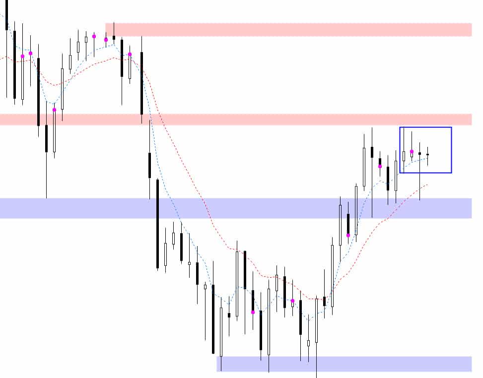
Here is the same GBPJPY chart below, and how I would manage my support and resistance levels for the same scenario as above…
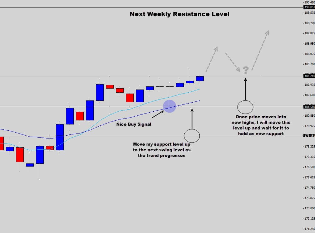
As the trend progresses, I will move my support level above. Because this is a strong bullish trend – I am only interested in being a buyer off support.
If this bullish price action signal does indeed see good price follow through, then the market will break into new highs. I will move my support level up to the recent high that was just broken – in anticipation that it will act as new support. If it does act as new support, then I will be looking for more buy signals here – remember I am looking to buy off support levels in this bullish trend.
The only resistance level I have marked is the next major weekly turning point, which is a fair distance from price at the moment. When you compare the two charts, the first trader’s chart looks restrictive and almost scares you out of getting into the trade. My chart focuses more on the up trend and only alerts the trader to the upcoming major resistance level.
I won’t mark any other resistance levels in the interim unless price action warrants me to do so. If we start getting some serious bearish price action off some of those old swing levels from the recent price history, then yeah we need to mark them out.
Checkpoint
During strong trending conditions, don’t mark untested support or resistance levels from the price history unless they are MAJOR turning points in the market. Strong trends are constantly taking out support and resistance levels as the market swings up and down – don’t spook yourself out of good trend trades just because of old untested swing levels.
Conclusion
I know there are 1000 ways to ‘skin a cat’, and 1000 different methodologies for marking support and resistance levels on your chart. Everyone is going to find the way that suits them the best. This article was intended for Forex traders who want a different way to look at their charts.
Today I’ve highlighted what I believe are the biggest problems with the way traders approach marking their levels and tried to offer logical, clear-cut solutions that really make your market analysis shine, by keeping things simple and straight forward.
I’ve helped many Forex traders move away from these confusing strategies and methods, and ushered them into the simplistic, minimalistic and logical way that is price action trading – where they have found not only success, but feel much less stressed out about their trading.
If you found this article helpful or insightful, you might be interested in checking out some of my other popular Forex trading lessons.
Hopefully you found this article helpful and taken something away form it that you can apply to your charts right now.
I wish you all the best on the charts and will see you in the next lesson.